
Well, now I’ve gone and done it. I’ve hung out my own shingle; set up my own shop; launched my own website. You’re looking at it.
A Long and Winding Road
I never really set out to become a “foundry”. When I first entered the type industry, twenty-five years ago, one-person foundries were uncommon. The typical path for a designer to get a typeface on to the market was to have it accepted by an established foundry, not unlike an author securing a publisher to produce their novel.
I was lucky to establish a long-term relationship with the Font Bureau. They published my first retail typeface, and then they landed a couple commissions to expand the family. Both Whitman and Whitman Display did quite well as part of their library, and I made decent royalties. It was a perfectly happy and mutually beneficial relationship for many years.
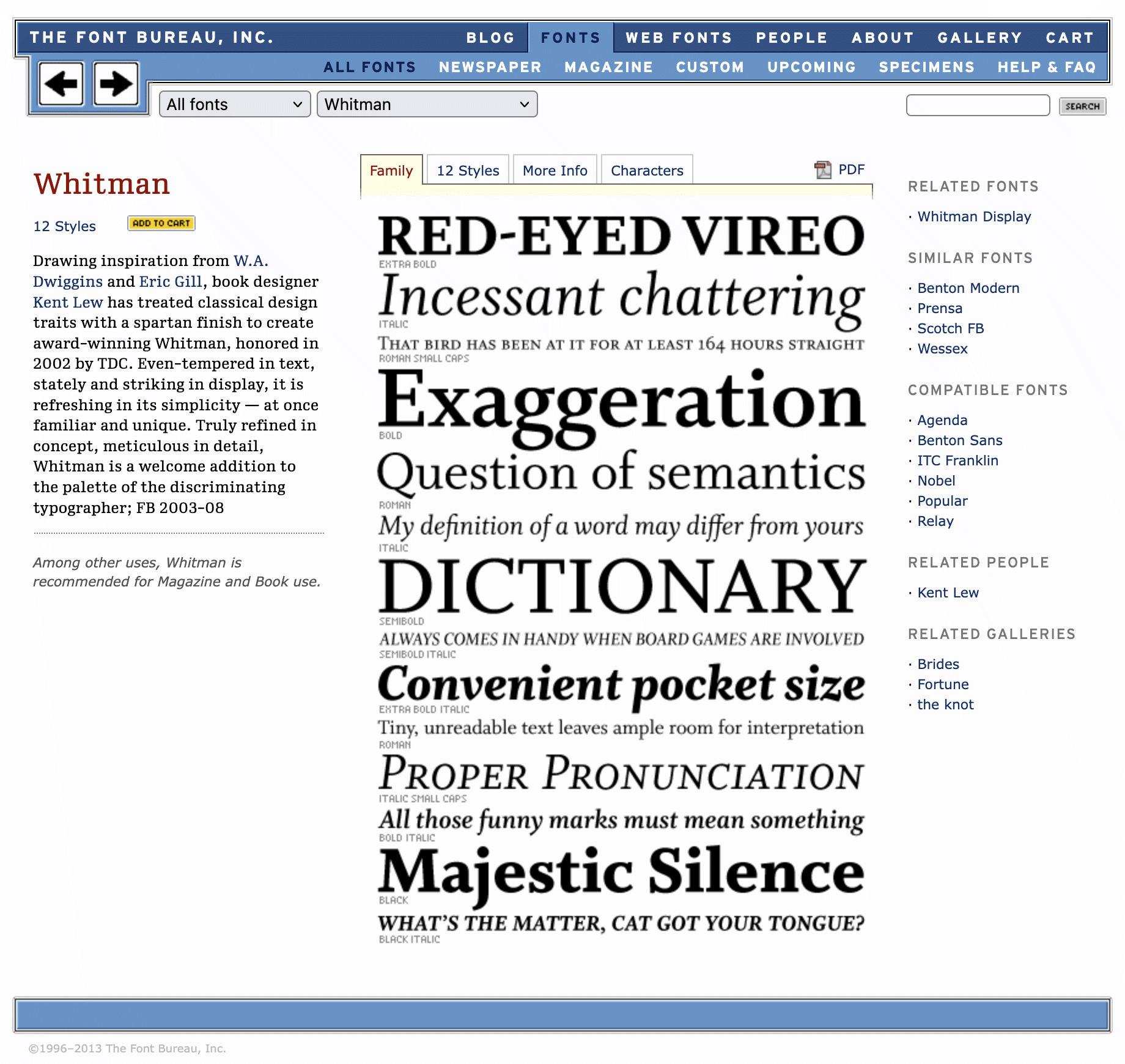
Whitman font page on the Font Bureau website, ca. 2013
‘But We Were On a Break!’
In 2019, I took a five-year sabbatical of sorts from the typographic scene to oversee the design, construction, and start-up of a municipal fiber-optic broadband network for my small rural community.
During this hiatus, Font Bureau spun down and all rights in the Whitman fonts were turned back over to me. Because my attention was fully elsewhere, I took the easy path and just signed a distribution agreement with the Type Network to let the fonts remain available through them. As such I became what I jokingly referred to as “an accidental foundry” in absentia.
That broadband project was a labor of love — an enormous undertaking, a steep learning curve, and an accomplishment that I am very proud of. But it was never my ambition to become a fiber engineer (although that would definitely be more lucrative!).
My chosen profession remained type design. That’s my passion.
Elephants in the Room
I didn’t initially plan to strike out on my own. However, upon returning to the type business in 2024, I found that the industry and the font landscape had completely changed.
Driven by private equity, Monotype has bought up and subsumed many previously independent foundries (including Font Bureau), thereby fully consolidating the hegemony of their MyFonts platform.
Google Fonts has matured — with some half-decent, broadly useful faces, actually — to provide a viable no-friction, no-strings library of good-for-whatever-ails-you free fonts across a range of styles and scripts.
And Adobe has shifted all their apps to a subscription service, complete with a bundled all-you-can-eat buffet of popular fonts included, all readily and easily sync-able — creating what amounts to a gated community that one need never venture out of.
Add to that the flood of talented young type designers pouring out of the degree programs and releasing so many excellent fonts.1
Finding a New Home for Myself
There are still well-established, respected foundries publishing independent designers’ work. I have connections and colleagues I could have probably leaned upon to try to replace what I had with the Font Bureau. But I realized that I’ve grown even more stubborn and opinionated with age, and my goals and interests now would inevitably diverge from that of others’ who might have a stake.
Really, let’s face it, my typefaces are rather ordinary.2 They are not designed to “trend”. They don’t really lend themselves to tagging or categorization in any meaningfully distinctive way. And so the larger the arena in which they’re presented, the more easily they tend to get buried and undiscovered. Well, heck — I can do buried and undiscovered all on my own!
And so here I find myself. I guess I’m a foundry now.
Frankly, I chafe a bit at that label, because somehow “foundry” seems more formal and organized than I see myself. I have no desire to hire assistants and build a studio practice. This “KL Type” is just me, and will always only ever just be me.3 I am an independent craftsman, working quietly away at my trade. You won’t find my storefront in the mall or out on Main Street. This here is now my little workshop, just down a side alley.
Welcome. Thanks for stopping by. If you need me, I’ll be tinkering away in the back.
-
Not to mention, now, a looming avalanche of A.I. slop fonts coming on the other end of the spectrum. ↩︎
-
My friends are more charitable and say they’re “timeless”; but what do they know? ↩︎
-
The only reason I’m using a nom de fonderie at all is because I wanted a different domain than my personal kentlew.com one, which I’m reserving for some more personal artistic endeavor, maybe in “retirement” some day. ↩︎