
In the Works
The projects presented here have managed to achieve a status of more-or-less active development, and I am intent on eventually releasing them. Showing these unfinished designs is really just a ploy to circumvent my own foibles. Theoretically, I will now feel compelled to follow through. Perhaps sharing this work will also elicit some positive feedback and encouragement, which always helps!
Since I am no longer designing books, I don’t have the opportunity I once had to test in-progress fonts against real world demands. I am open to working out special arrangements for pre-release use. If you have a project that you think would be a good candidate, please get in touch.
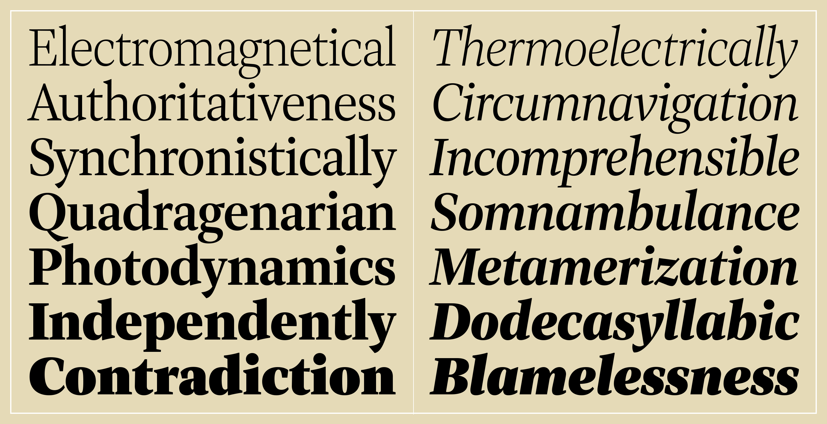
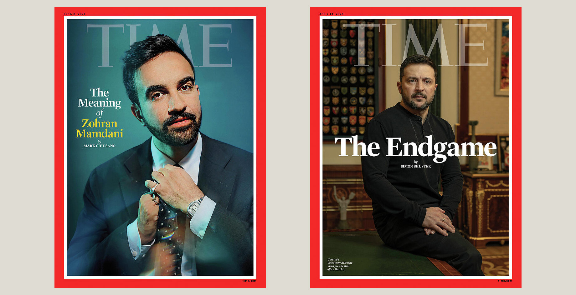
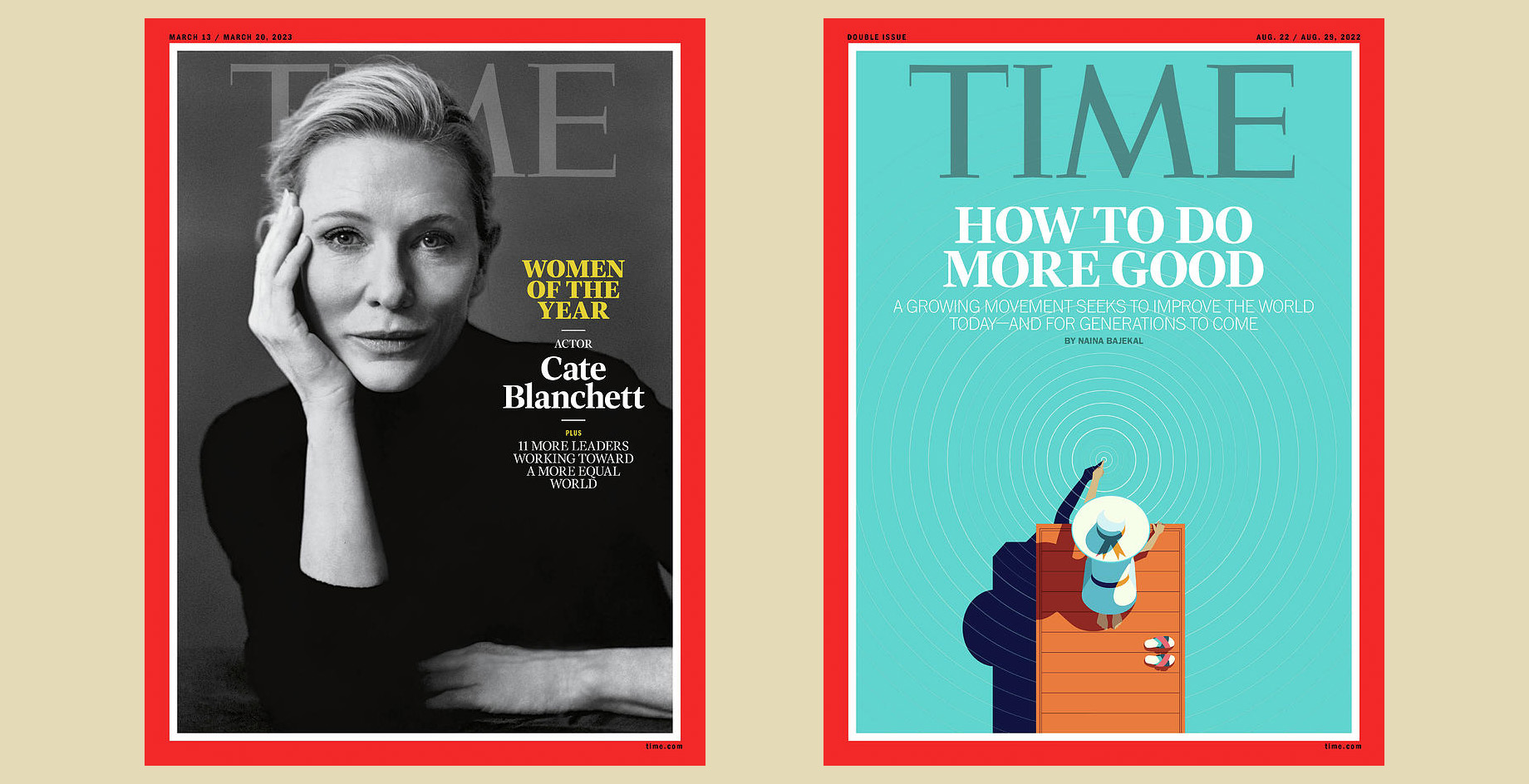
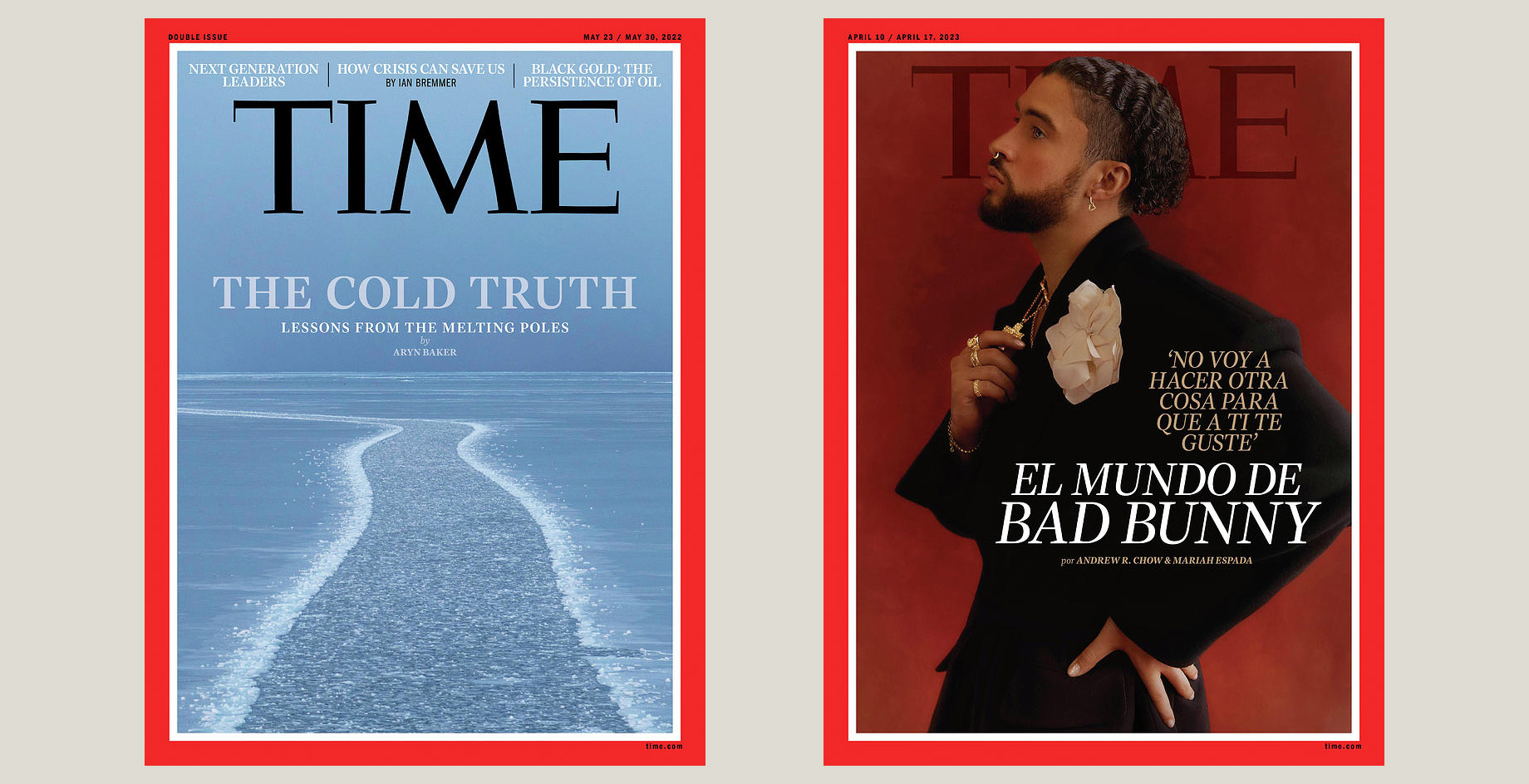
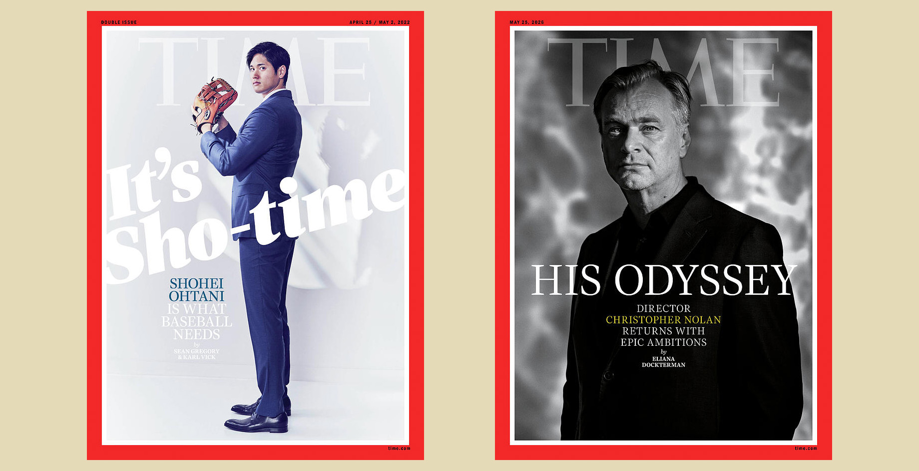
This is the next release I am actively working on. Haffner Display was commissioned by TIME magazine in 2021 as a complement to Haffner Text, for use in headlines. The TIME team had me push the extremes a little on the Thin and Ultra end of the weight spectrum to give it a broad range. After seeing it in print for the past several years, there are a few details that I am revisiting and revising.
The character set for the commission was minimal, so I am expanding it to my standard for retail releases which includes extended Latin language support and additional features. I aim to have this ready for release in early 2027.
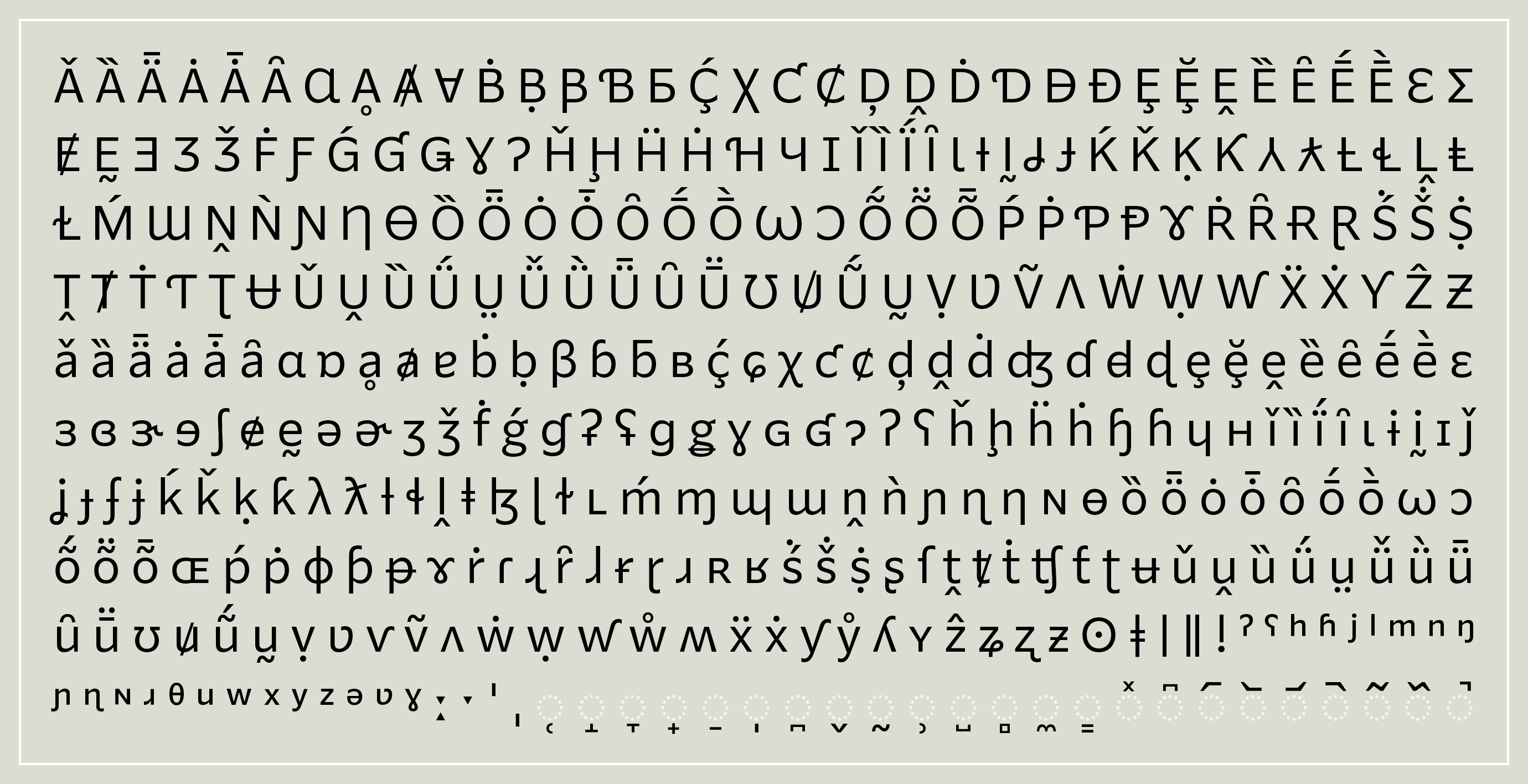
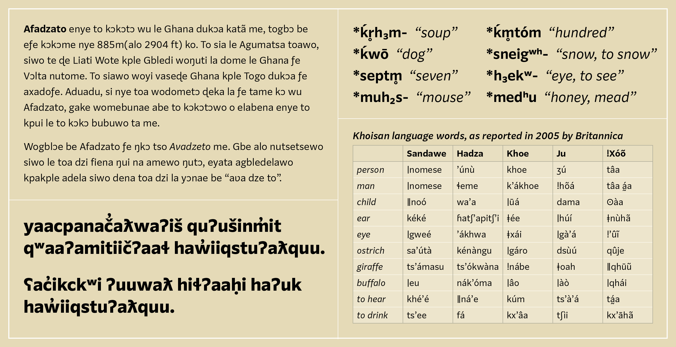
One of my primary motivations for drawing Parling was to have a basic sans serif that I could build upon to explore the outer reaches of the Latin character set and support for minority and under-resourced language communities.
Christoph Koeberlin’s work sparked my interest in African Latin support. Typotheque’s research on Indigenous North American languages and John Hudson’s work with Microsoft on Skeena Indigenous have similarly fueled my interest in that arena. And all of those language groups quickly lead deep into International Phonetic Alphabet territory. As a type designer & typographer, I naturally find all these unfamiliar characters and new word shapes quite beguiling.
Many of these characters have been roughed out, but plenty of work remains to refine the shapes and fine-tune the combinations. Further progress at this point will likely depend upon engagement with a specific language community or users. I doubt there is much commercial demand for these, so I’ll probably explore generating targeted-language subsets and consider making them available under some kind of Creative Commons–like, noncommercial license.
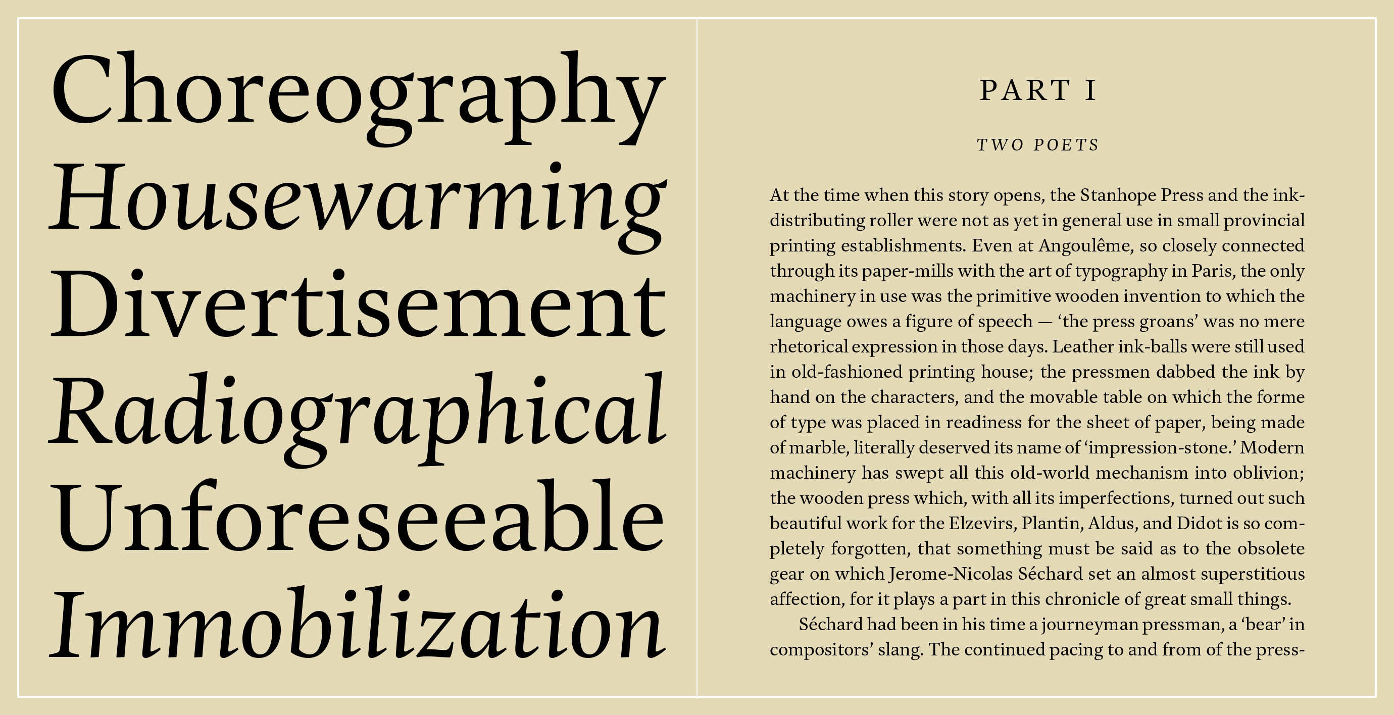
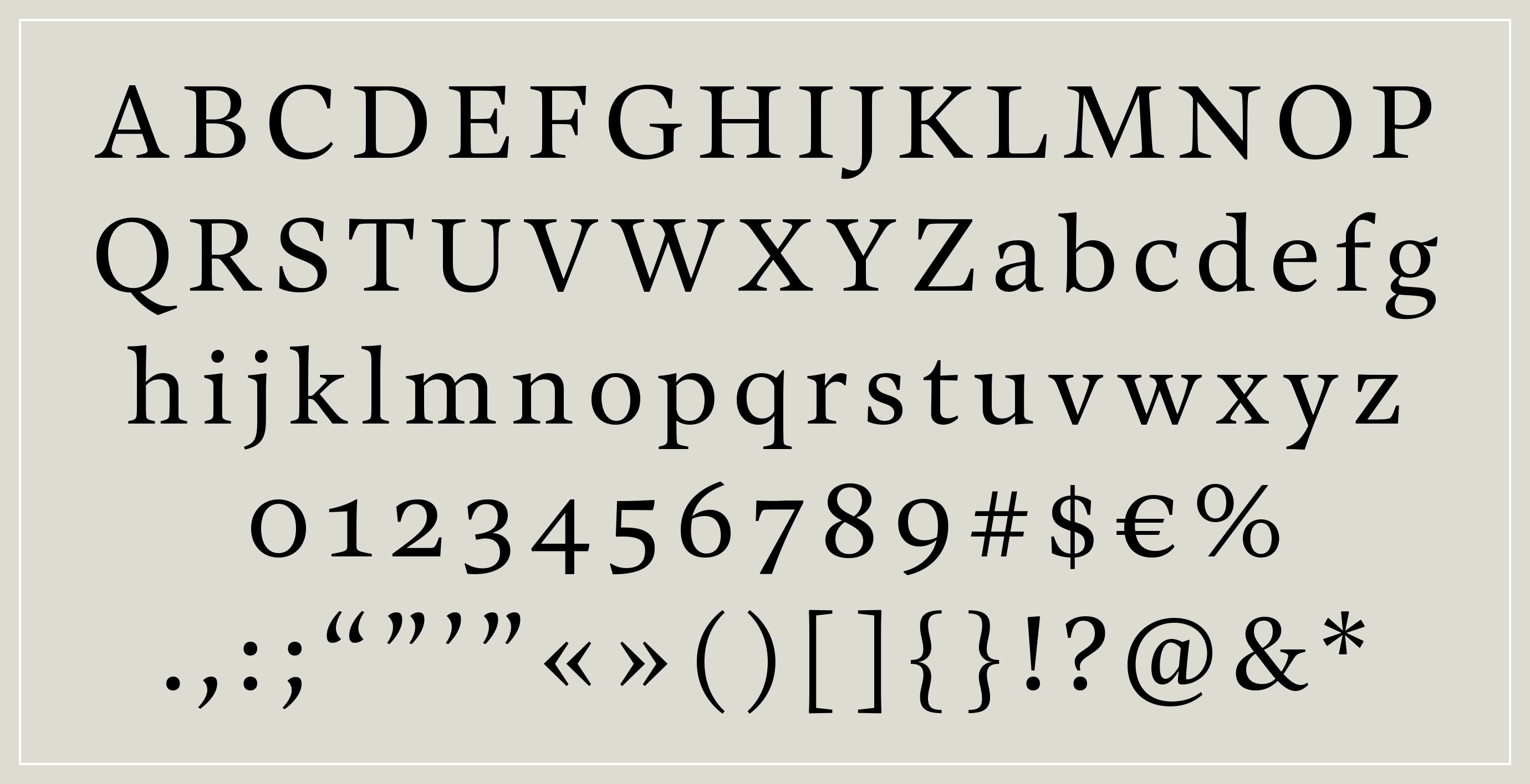
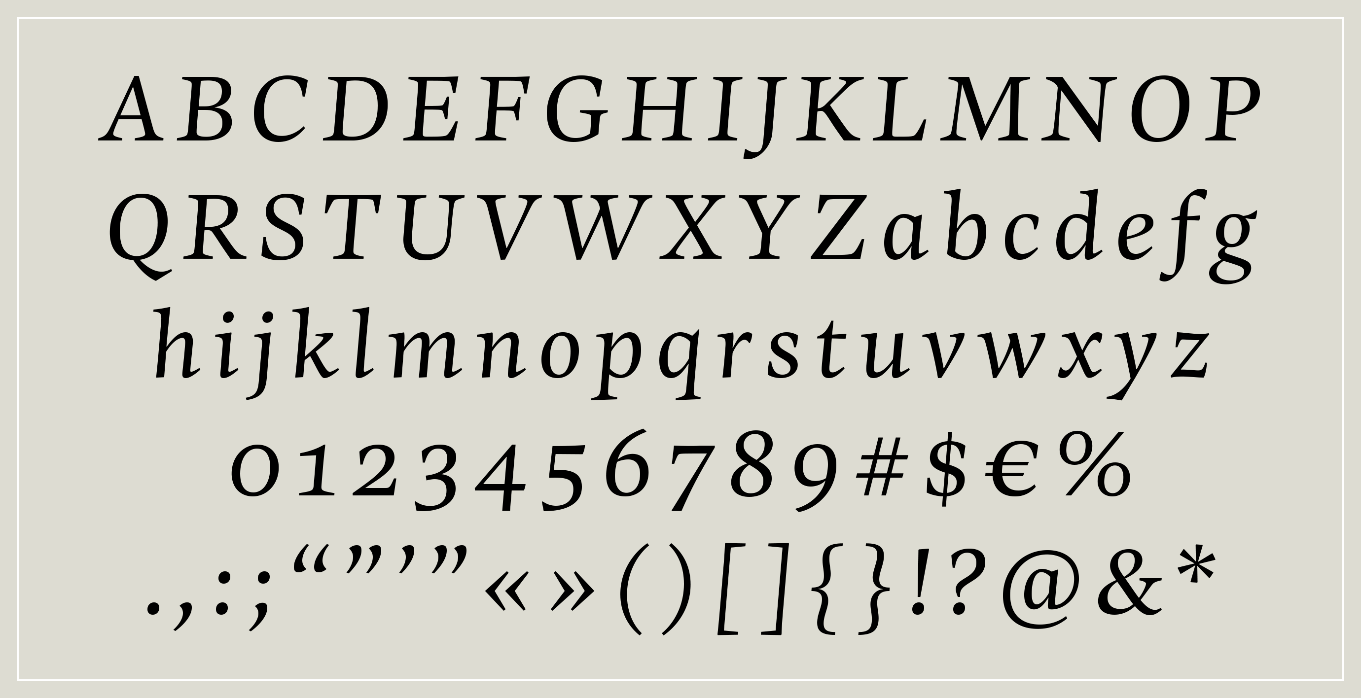
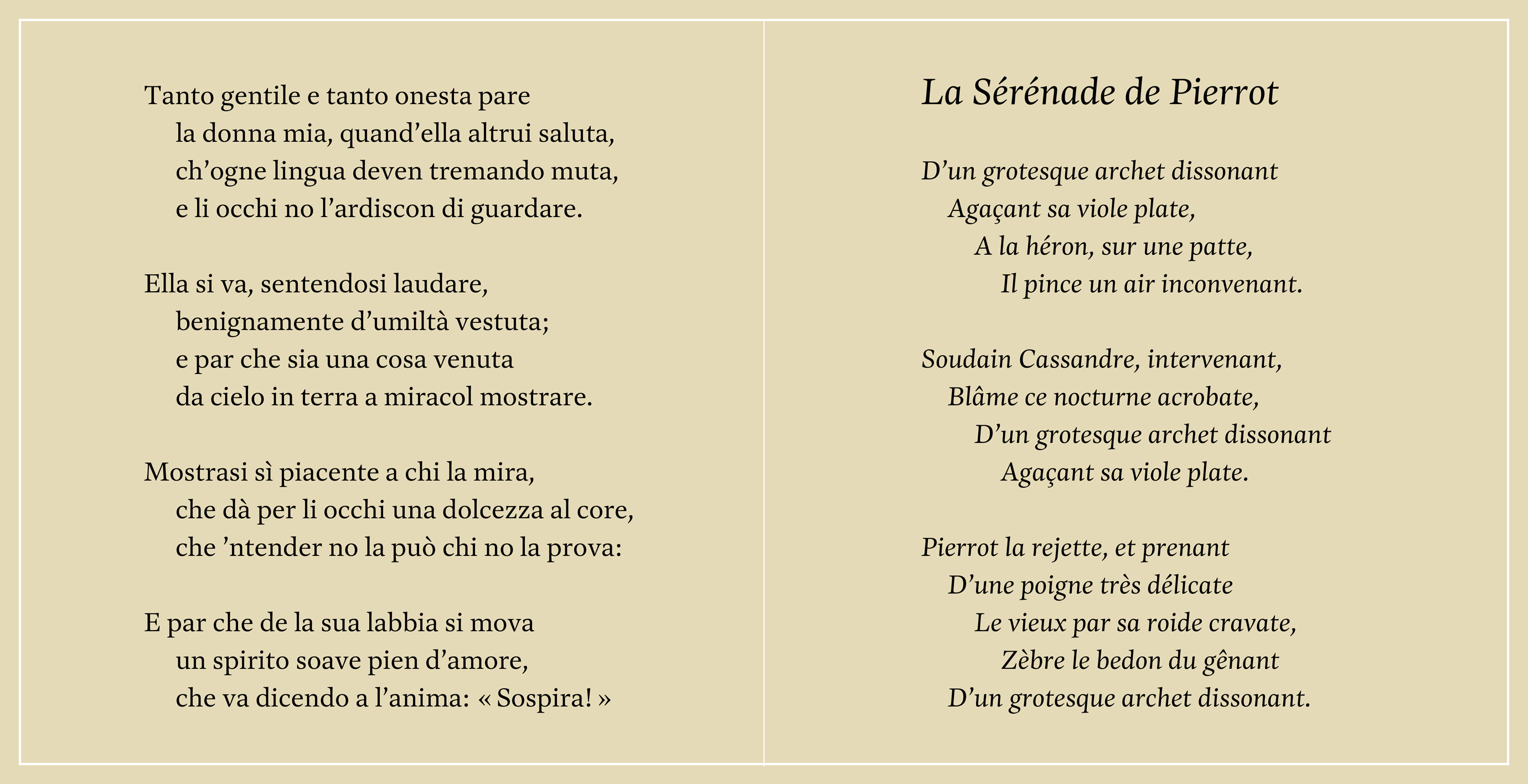
I see this typeface as my homage to Adrian Frutiger and Hermann Zapf. It traces its roots to a 2009 Typophile thread, started by Nina Stössinger, which centered on a strange-looking setting of Frutiger’s Méridien. (Spoiler: Adobe Optical Metrics were at fault.) But the discussion got me looking closely at and appreciating Méridien anew. I admired its pronounced sharpness while still being somewhat organic; but I also felt that it appeared a bit fragile in text. I wondered what it would be like to attempt something in a similar vein, but with a bit more robustness.
It was also an exercise in taking a more intuitive approach to drawing: less rigid and more lyrical than my typical habit. Over the years of intermittent tinkering, it has taken on much more influence from my deep admiration for Palatino and its kin. Unlike Zapf, however, I am no calligrapher nor do I aim to be. My work will always be more sculptural than scriptorial.
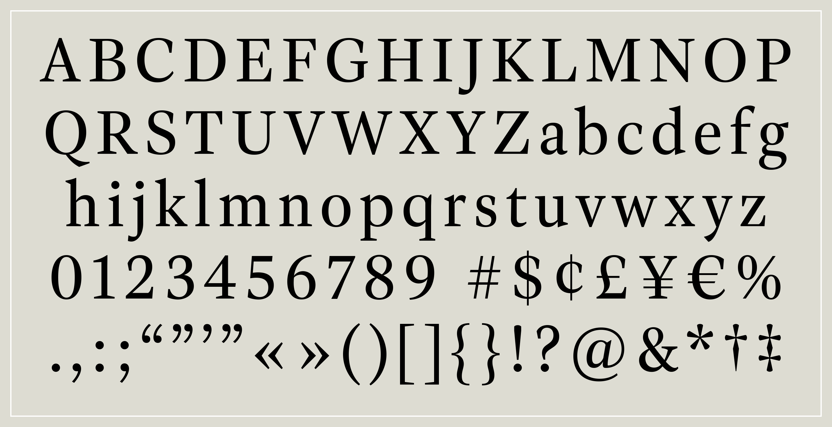
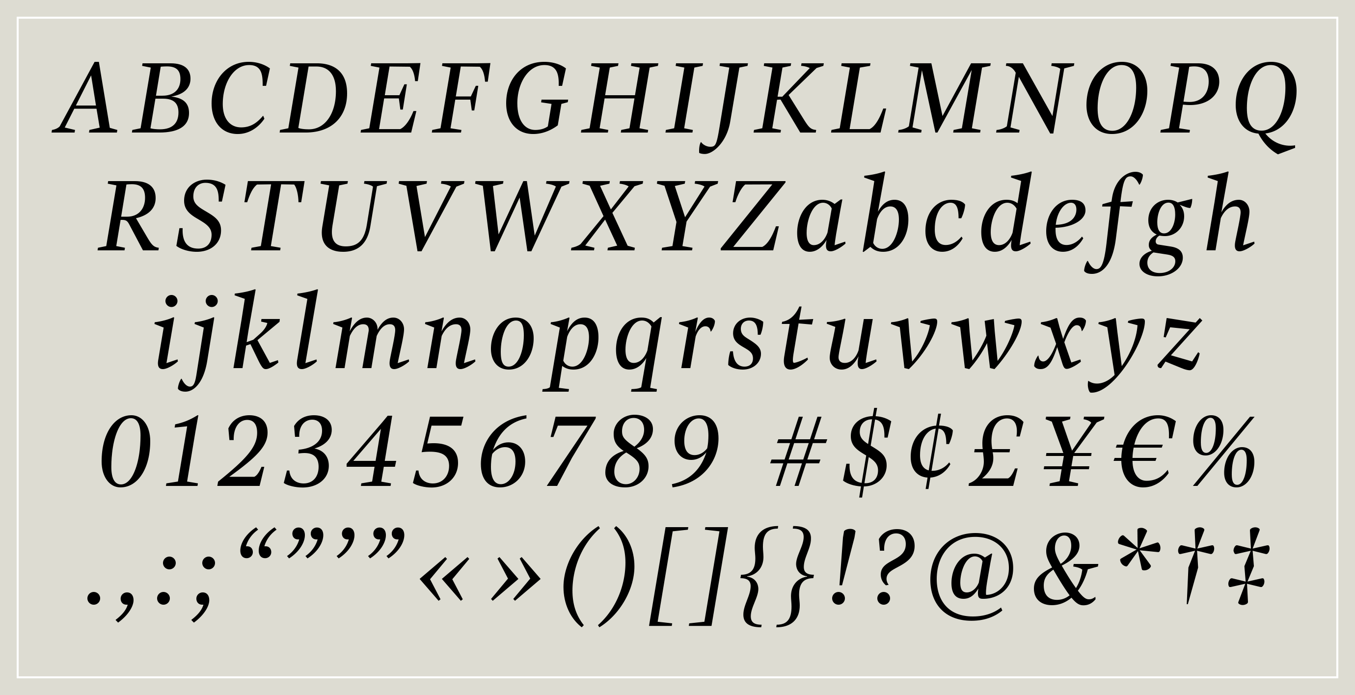
This design still needs to mature, and I am keen to invest more time, as I am able. The character set is minimal for now while I work to get the basic harmony and rhythm worked out. I like the direction of the italic, but I’m not convinced it can get away with such an upright angle. I may need to either make it narrower, along an Aldine model, or increase the angle. What do you think?